June 18, 2007
Palette Editing
article 3/5
The majority of indicators use a limited number of plots, so a few basic colors can accommodate most charting requirements. Combining this with the fact that the primary colors are easier to distinguish apart, compared to graduations of any one color, makes the colors of the rainbow a stand-out choice for everyday color preferences. Conveniently, ROYGBIV is a mnemonic that makes the rainbow numbers easy to remember when using color indexing for quick code writing.
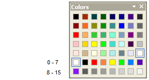
The first sixteen numbers of the color index are reserved for custom colors, so this provides an opportunity to apply this system. (The color index is based on a zero count system so the available numbers are 0 – 15).
WARNING – THE FOLOWING PROCEDURE WILL CHANGE ALL THE DEFAULT CUSTOM COLOR INDEX NUMBERS, EXCEPT FOR BLACK, WHICH IS ONE. THIS WILL AFFECT ALL SAVED INDICATORS THAT USE CUSTOM COLOR INDEXES, OTHER THAN ONE FOR BLACK.
To match the colors of the rainbow to number 2 – 8 of the color index:
a) go to Tools > Preferences > Colors [TAB] and click on the Palette editor button ( the Color window will open);
b) select the first box in the top row of Custom colors;
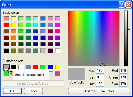
c) click on White, in the Basic colors table;
d) click on the Add to Custom Colors button (White will become colorCustom1 or index number 0).
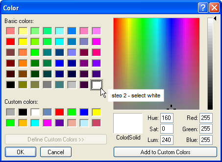
e) select the second box in the top row of Custom colors;
f) click on Black, in the Basic colors table;
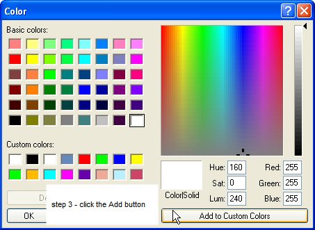
g) click on the Add to Custom Colors button (Black will become colorCustom2 or index number 1, which is the installed default for black).
e) Repeat the three stop process for Red, Orange, Yellow, Green, Blue, Indigo and Violet using boxes 3 – 9 inclusive.
f) Use the same procedure to set the remaining seven to any preferred color.
g) Close the Color window and click on Apply on the Preferences window before closing it (this will confirm the new color settings).
To use a color that is not in the Basic color table:
a) select the Custom color box to be changed, followed by the Basic color;
b) then modify the selected Basic color’s Luminescence by dragging the arrow head up and down the vertical scale. (In this example the graduated shades of grey were added to Custom Colors 13 – 16 using this technique).
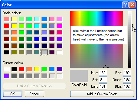
c) Additionally the Hue or the Saturation can be changed by clicking and holding on the moving cursor, inside the color matrix panel, and dragging it up/down (Saturation) or left/right (Hue).
d) When the desired color is produced in the large Color/Solid box click the Add button.
e) Click on Apply on the way out.
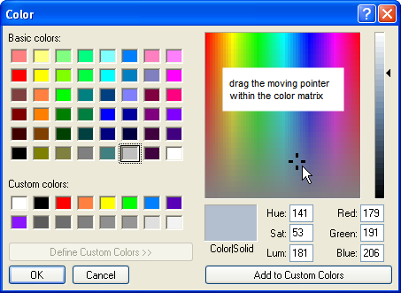
(In this example the Basic color Medium Grey has been changed slightly by the addition of a little Blue and a slight reduction in Red (Saturation), as well as changes to the Hue settings, while the Luminescence is constant).
The new Custom Color settings will now be available in the Color Picker, or within formulas via color index numbers 0 – 7 and 8 – 15, or colorCustom1-16.
(Note that for maximum contrast between the colors it is better to use only six colors, along with black and white, as there are only three primary colors (RYB) with three possible primary combinations between them (O,G,V). Indigo is an exceptional color, not being derived solely from the Primary Colors. For this reason it is hard to distinguish between Indigo and Blue or Violet, so for clarity Indigo can be left out if desired).
 Filed by brian_z at 8:48 am under Using Custom Colors
Comments Off on Palette Editing